There were a couple comments this week asking for suggestions for how to better match colors when shopping for fabric online, so today I’ve put together some suggestions for ways to have greater success getting fabrics together for a particular project when you can’t see them all at the same time first. I don’t think I really processed that one of the hardest parts of shopping online for fabric, especially for quilters, is to get the colors to coordinate well, and if you’re already working within a budget, avoiding misfires gets even more important. These suggestions ought to give you some guidelines that will help you get your selections right the first time!
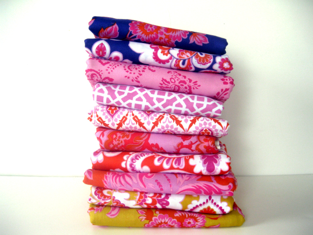
 Image of Honey Child by Jennifer Paganelli for Sis Boom Fabrics via A Sewing Journal
- You can choose fabrics from within a coordinating collection to ensure that the colors match. The vast majority of quilt-weight cottons out right now, which can be used for anything from apparel to crafts to quilts to bags and home decor, are created within a collection. All the fabrics in a particular collection are designed and colored to coordinate with one another. Even when there are multiple colorways, or color groups, in a collection–for example, eight different prints and each print is available in three colors equals three colorways/24 prints total–the individual prints are designed to work with one another. Remember that a print doesn’t have to match another print in order to work with it. By shopping within a particular collection, you can easily ensure that all your fabrics will play nicely with one another–in fact, that’s the whole purpose of creating coordinating collections in the first place! (While I have heard criticism that using one collection exclusively for a particular project is “cheating,” I maintain that if you like the fabrics and you enjoy them together, then they work, so go for it.)
- You can choose fabrics that are designed to coordinate, but not from the same collection. Some designers have begun producing solids that are designed to coordinate with their printed collections–these can be quilt cottons, voile, velveteens, or home dec fabrics. Westminster/Free Spirit is largely leading the way with this, so Anna Maria and Amy Butler and Joel Dewberry and Jay McCarroll’s lines all have solid coordinates that are specifically colored so that they will work with the prints. Much less work on your part! The downside, of course, is that not every collection or designer or manufacturer has such colors.

- Many manufacturers are now working to make collections from various designers coordinate with one another. If you purchase a fabric from a Fall 2010 collection put out by Robert Kaufman, for example, the colors in that collection are designed to coordinate with other Fall 2010 collections–and some Spring 2011, or even Fall 2011, collections, too. It makes it nice for designers and consumers alike to know that particular shades will translate across multiple fabric groupings so that we can pick-and-choose those prints that we like best and combine them with the confidence that the inks used to print them are really the same color–they don’t just look like they’re maybe sorta the same color on our screens, but then in natural light it turns out they’re totally different colors altogether. Save your selvages when you remove them from your fabric so that you can search for other fabrics by the same manufacturer (they have websites of their own where they showcase collections, and most online retailers sort by manufacturer or name the manufacturer in the details listing for each fabric).
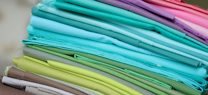
 Image via Bridges on the Body.
 - Use a standard reference color to communicate with the shop owner from whom you’re ordering. Screens are notorious for displaying colors inconsistently from one viewer to the next. I know some folks advocate norming your display to ensure that you’re seeing the same colors that would show in natural light, but not all of us feel confident that we can do that accurately. In theory, you could use Pantone colors to compare, but aside from the fact that most online shops don’t give you Pantone referents for fabrics, it’s not really a universal language outside of professional designers. What I find much more effective is to compare the color you’re seeking to a common reference tool, and use that to guide you as you make your selections. I’d suggest one of the following (and maybe both): a Kona solids color card, and Guterman threads. Kona has a huge range of solid cottons, and one of them is just the color you’re looking for. Say you’ve got a pile of fabrics and you’re looking for a backing. You check your Kona reference card, find a color you like, and search for prints in that color. You can use that color name as a reference when you communicate online with shop owners by asking them if they have anything that matches that color in stock that they’d recommend, or by selecting fabrics from their shop front and then contacting them to visually confirm that the print matches the Kona you’ve selected. Same thing goes for Guterman threads: we carry them at Whipstitch, and I know that if I want a fabric that matches thread color 712, I can ask the ladies to help me choose prints that are close in color. (The reverse is true, too: I can ask them to choose me thread to match my project, too.)
 Image via Blue is Bleu on Flickr.
 - Not sure what colors to choose? Try a color-match generator to guide you. There are some cool gadgets online that can help you if you’re less worried about whether a color is a perfect match than if it will coordinate with your project: say you have a pile of fabrics you love for a quilt, but you’re not totally confident that they will work well together. Use a color generator to suggest combinations you might not have thought of, or to verify the harmony of the ones you’ve already selected. You can even shoot a photo of your fabrics to create a palette of the major colors that appear within them–even if they’re from a zillion different collections! I know! Try the Color Scheme Designer, the Color Palette Generator, or the free online color palette.
- When shopping for isolated fabrics rather than coordinates, read descriptions carefully and ask for help. In order to best choose fabrics online, take care to really read what the shop is telling you. Often, descriptions are written with plenty of information to help you determine whether the red you’re seeing is a candy-apple red or a deep, burgundy red. Always, always ask for help–chances are, if you find a shop owner who isn’t willing to answer your questions about which fabrics coordinate with one another, you have found a shop owner who isn’t going to follow through in other areas of customer service, so search and find a shop or shops that you feel good about doing business with over and over again!
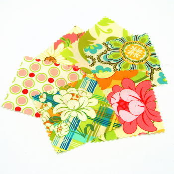
 Image via The Fabric Fairy
 - If all else fails, request a swatch! For some folks, this is the very first line of defense. For others, it’s the last thing they want to do. But if you feel as though you really can’t make a good decision without actually holding the fabric in your hand, then order a small swatch and verify for yourself. If you can’t get a swatch, or your favorite shop doesn’t sell them, then a fat quarter is a great alternative if you are planning to order many yards–if it doesn’t match, you can always use it for another project, but you wont’ be stuck with yards and yards you’ll never have use for.
Matching colors when you don’t have access to the fabric can be tough. Using some simple guidelines and knowing a bit more about the options that are out there in online FabricLand can help! Let me know in the comments if you’re seeing other ways to get great fabrics online–I’d love to hear them!


Amy Caroline
May 12, 2011 at 6:43 pmMy daughters and I all “Ohhhhh”ed out loud when we saw that first picture, lol! Thank you so much for these posts!
Jolene
May 13, 2011 at 3:05 amI also use the design section of certain websites. Even if I don’t plan to buy fabric from that site, I’ll use the design section, which allows you to put all your fabric choices together to see how they look next to each other. When I’ve found a combination I’m happy with, I’ll place my order either from the site I used, or others if I can find better prices someplace else.
Jo @ a life in lists
May 13, 2011 at 8:58 amThanks for the great tips! The other thing I’ve found useful is searching flickr/etsy/pinterest/google blog search for items made with the fabrics I’m looking at (either by searching the flickr groups of big name designers, or simply entering the designer/fabric range as a search term). For most ranges, it’s possible to find at least one or two samples. I can then see how those images compare to the online fabric store’s image (seeing the fabric in different pics can help work out the exact colour), and see what co-ordinates other people have used.
Jennifer O.
May 13, 2011 at 2:50 pmI’ve found that most of the color matching I’m trying to do online involves finding a solid color to match a print. I do have a Kona color card, which is great, but it lives at home and I do my online shopping at work (I don’t have internet at home). I either have to do my homework ahead of time, which doesn’t always work when inspiration strikes, take a gamble, or ask for help. I’ve emailed shop owners (Kathy at Pink Chalk Fabrics was one) for help narrowing down choices too.
TheBargainBabe
May 15, 2011 at 6:40 pmI did not even THINK to request a swatch! Genius! Thanks for the great info. 🙂