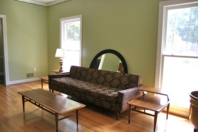
I’m currently reviewing swatches and making plans to–at long last–make the drapes for our living room. Yes, the same living room. It’s still not done. Here we are on the average day:
Which I don’t mind so much–except you can basically see straight into the house from the street. Add that some windows in bedrooms face the street and those have curtains, and the variation in appearance from the road really bugs me each and every time I pull into the driveway.
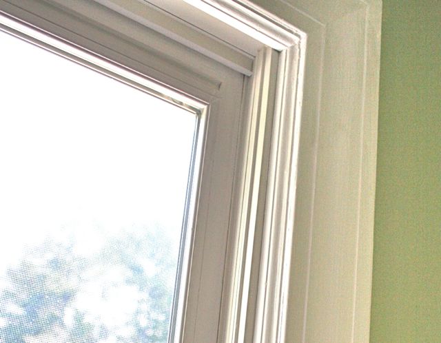
I’ve been pondering what to do for these windows since we moved in. Leave them bare was option #1, but ruled out for the reasons above. Wood blinds was option #2, but I’m rejecting that based on the shape of the windows–they’re too shallow to allow an inside mount, and I wanted to avoid the outside mount since I love the overall look of the room as it is.
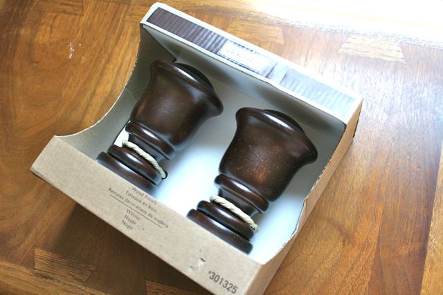
Most wood blinds require 1.5″-2″ of depth to make room for the hardware, and ours are about 3/4″, so that’s a no-go. Option #3 is drapes, which is where we are now. I’ve selected some finials and rods in a dark wood that complements the wall unit on the other side of the room, and looks lovely with the wood of our coffee table and side tables:
So now I have to find the perfect curtain fabric and sew up some panels. Well, OK, it’s a little more complicated than that.
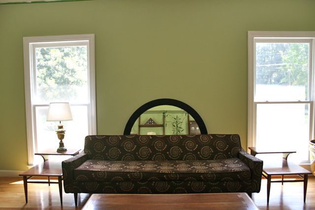
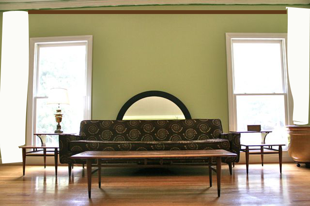
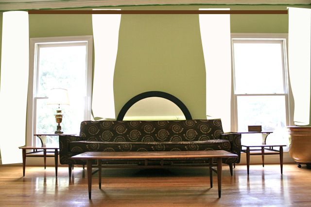
First, I don’t know if I want to do two panels on either side of each window, or one panel on the far side of each window and “frame” the bare wall in the middle:
We’re shopping for a large, horizontal piece of art to put on this wall–it’s nine feet long and the space over the sofa would do better filled. We’ve got the mirror there as a placeholder, but I’m not really feeling it in the long term. So I’m asking myself, do I want to use the curtains on either side of the art, or do I want to frame the windows with curtains on each side and then float the art in the middle?
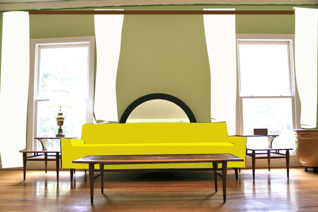
Some mock ups:
What can I say? I’m an artist with the Photoshop. But you get the idea here.
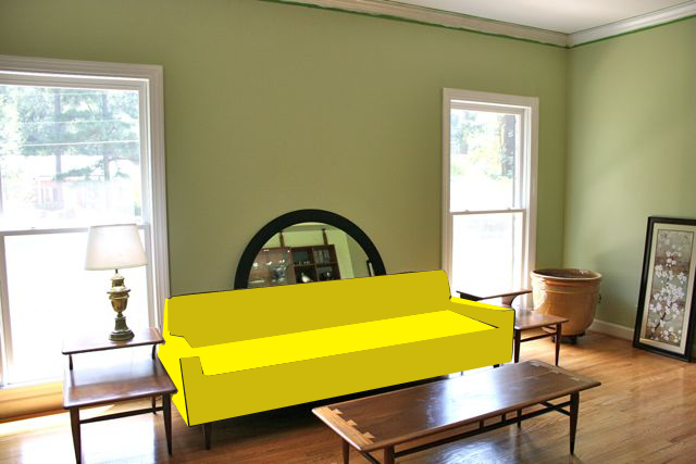
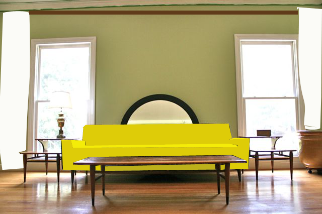
Of course, one of the main considerations is the color of the sofa. This brown…I do not love. The couch is totally getting recovered. As in every other room in the house, I’m working in ONE Whipstitch-yellow element here, and the sofa is IT. A statement sofa, as it were. I think I’ve found the perfect fabric for it, right here at a local interior dec fabric shop–I can’t locate it online but it’s a near-solid woven geometric dotty-thing and I love it. Let’s do a little mock-up with that, too:
So I’m asking: do I do two curtains, or four? Is it more modern and in keeping with the vibe of the room and the house to “frame” that wall, or should I go the slightly more traditional look and do two curtains on each window? I’m more than willing to spend the money and time on more curtains, but only if the final LOOK is right–otherwise, why bother? Feel free to weigh in, y’all–hubs and I are super, super ready to have these windows covered!
Again, the options are one curtain:
Or two:
Sofa color is (probably) not up for debate.
P.S. If it makes any difference, I’ll do the same curtains/drapes in the dining room, which is immediately next to the living room and accessed through a double-wide doorway with no door, so the window in the dining room is visible from the living room. Because there’s only one window in the dining room, there will for sure be two curtains on that one window, regardless of what I decide to do in the living room. Just FYI.
P.P.S. Oh, and they don’t have to be white. Oops. Guess I could have said that. We’re leaning pretty heavily toward a textured white/just-barely-cream in these two rooms, but I also have my eye on a silver metallic dupioni (yum! but a lotta look) and a couple prints (including this, this and this, any of which would be kinda cool with the round re-covered chair on the other side of the room)–we can check those out when the swatches get here. For the time being, let’s work on how MANY and then we can talk about what KIND.



Sparrow
August 27, 2012 at 2:40 pmPersonally, I’d go for Roman shades over drapes for that space. But if you definitely want curtains, I’d go with one on each.
Totally love the yellow couch, btw.
Deborah
August 27, 2012 at 2:48 pmWe thought about Roman shades, but decided they wouldn’t work for the same reason as the blinds: the windows just aren’t deep enough to allow an inside mount, and I don’t really want to do an outside mount in here. I like seeing the trim around the window openings. We *are* going to do white Roman shades in the breakfast room, since we get a ton of afternoon sun in there, and I don’t want to do curtains in that space.
I’m pretty pumped about the sofa, I’m not going to lie. And I don’t have to do the work! My friend has a Guy Who Does That, and he even picks up and delivers. 🙂
Traci
August 27, 2012 at 2:49 pmMy choice would be 4 curtains. You have a lot of wood and sharp edges in the room and I think the additional fabric volume would help soften up the space a bit. And I agree with the idea of a textured white curtain.
Just my 2 cents. Looking forward to seeing the final version!
Deborah
August 27, 2012 at 2:52 pmAgreed! I want the whole house to feel modern and clean, but also warm and welcoming–not a contemp museum, but a really chic and stylish HOME. I think the curtains in here will help with that a bunch. The textured white is a strong front-runner right now, but I wanted to do my due diligence with the swatches! I’m expecting it’ll be post-Labor Day at the earliest before I have the yardage and the lining and really get them hung, but I’m itching to get this task done so I can justify sending the sofa off to the upholsterers!
Barb_in_GA
August 27, 2012 at 3:08 pmTwo drapes on each window, I think. And I love that dupioni.
Michelle
August 27, 2012 at 3:23 pmI’m totally feeling the large art over the sofa framed by one drape per window. I adore yellow, by the way.
Lauren aka Giddy99
August 27, 2012 at 3:46 pmLove the furniture!
I have mid-century modern decor too, and a 1952 combined living/dining room. If you’re wanting to stay “period-correct” then curtains would be the thing, but I agonized over mine, and ended up using the sliding flat panels from IKEA in white solid and black sheers. Alternating two white solid panels with a black sheer (so I can slide the white solid panels over the sheers when I need privacy). It’s very modern and complements the mid-century modern, too.
lisa
August 27, 2012 at 4:02 pmOk, here are my questions. Are you going to have one rod all the way across? Also are the curtains going to be pulled to the side of the molding?
Deborah
August 27, 2012 at 4:04 pmActually, I think it’s going to be two rods, one over each window, and yes, the curtains will be pulled aside to the edge of the trim. I like to see as much of the window as I possibly can!
Tracy
August 27, 2012 at 5:18 pmwell ~ based on the fact that it drives you nuts from the outside that the windows are unadorned, I suspect you will be happier going with the less modern method of 2 panels per window.
p.s. I loved that you showed us, again, what the options were – totally made me chuckle 😉
Deborah
August 27, 2012 at 5:21 pmHmmm… Do you mean that if it were one panel, it wouldn’t be functional? I was thinking it would be a wide panel, and totally able to cover the window when drawn, but pushed off to one side instead of split down the middle. The fabrics I’ve selected are all 55-60″ wide, and the windows are 36″. (And it was more fun than I expected to make those mock-ups, so I couldn’t help myself!)
Tracy
August 27, 2012 at 10:51 pmnot that it wouldn’t be functional, but if you only had 1 panel, and it were open – from the outside, it might look ‘lopsided’ (basing my thoughts on the statement ‘the variation in appearance from the road really bugs me each and every time I pull into the driveway.’)
Clover
August 27, 2012 at 6:25 pmHi Deborah, I had to weigh in on this one. My vote is definately 2 panels per window and two rods with the white fabric. The wall will seem too big with only one panel and then the size of the art will be too big compared to the minimalistic look of your furniture. Let’s know what you decide!
Dree
August 27, 2012 at 7:00 pmI would go with those flat sliding panels from IKEA. I love them. LOVE THEM. And I can’t ind anywhere to put them in my house, the style is all wrong, from arches to furniture to plaster details.
(Just FYI, I am not a fan of drapes. They are too dusty and just always look frumpy to me. We have fake wood blinds, one inside-pressure-mount cafe curtain I made, and one bamboo blind that I covered in back for privacy. Wood blinds are very $$ and very heavy.)
Sewing Princess
August 28, 2012 at 6:16 amI am another one to vote for Ikea sliding panels. I was going to suggest that from the moment I saw your post. I am not a big fan of heavy curtains (that’s probably why my windows are as bare as your right now)
Panels are not expensive either so if you get fed up you can change.
Dolores Attard
August 27, 2012 at 8:06 pmThe thing I got about the mock ups – the single panels made the room look really wide and long; the double panels made the ceiling feel really tall. I would go for the tall room option as that makes the room feel more spacious rather than long and closed in. Also, since you need to have 3 times the width of each window in fabric you’ll have a lot of fabric to hang to the side with the two-only panels.
kathyh
August 27, 2012 at 10:30 pmFrom the mock-ups it appears you want the drapes to go from ceiling to floor.
I can’t see enough of the room but why not bring the rod down to just above the window trim. Cosier.
If you can see inside from the outside, I think one panel on the outside window edges would look odd from outside.
if you want all the draperies/curtains to match from the outside – you just line them in the same lining fabric.
That said – my first thought was one drape at outer edges tucked across the window (on a diagonal soft drape) with a large carved wood finial holding it back.
Just across the top of the window trim.
possibly with some sheers on the windows themselves – but that might be dating the decor.
Em
August 28, 2012 at 8:51 amSince your main question is “one curtain … or two,” I’ll first say that while I’m usually a fan of 2 curtains per window, your mock-up actually sways me the other way. I like the look of the one tall curtain on each side because of the effect of the frame. This will be even better when you find a great piece of art to to above your yellow sofa.
But since you will have a yellow sofa, I wanted to encourage you to change the wall color. Have you considered going with a yellow and gray color scheme in this room? Yellow and gray look awesome together, that combination is “in” right now, but I think it’s classic enough to not be dated quickly.
You could go with a gray for the walls that is sort of a medium-warm gray and then choose your textured white for the curtains. OR you could choose a very a light gray for the wall and layer them with that dupioni silk you linked. That would be delicious. Then, find a piece of art that is mostly black-white-gray with pops of yellow. Or, get a family photo taken with some yellow flowers (or balloons, or a piece of accent clothing) and have it printed huge in black and white with just the yellow parts in color. You could get one of those large canvases from canvas people. They often have good sales.
Cheryl Arkison
August 28, 2012 at 1:11 pmTwo drapes. One of the prints. The Parson Grey works with the sofa as you have it, but I love the other two.
Love the lines in this room!
Sarah
August 28, 2012 at 10:07 pmFind the art. It’ll tell you what to do.
Susan
August 29, 2012 at 12:33 pmI think if you are going to go the print route, you should pick the third print. It matches the modern mid century feel that this room reflects. The other two prints have rather large medallion patterns, that might be better used as upholstery, or accents pices. Either that, or I think they would fit in real well with pottery barn rooms. (there’s nothing wrong with PB) But I don’t see PB in your living room. You could also do a almost sheer, almost cream color that you were thinking for, as the inner layer and then finish with the print on the outside.
so we added chickens
August 30, 2012 at 11:11 amNot to dodge the One Panel or Two question, but on the privacy from the street – you mentioned that you can see in – sheers might work as an alternative to blinds. These brackets: http://www.textilestudio.com/hardware.html (see the 3/8″ projection bracket) OR http://www.rejuvenation.com/catalog/products/inside-mount-cafe-set as examples have a narrow footprint and may fit in your windows. We did something similar. I can’t remember where we got our brackets (search: Brass inside mount drapery hardware). The type of sheer fabric and fullness of gather can make the difference between mod and fuddy-duddy. (and if you weight the hem, they won’t billow all over everywhere)
Irvin Marcos
August 30, 2012 at 12:16 pmI think, you’re an experienced interior designer. So it’s like very attractive. I want to look my bedroom like this. Thanks for these beautiful photos.