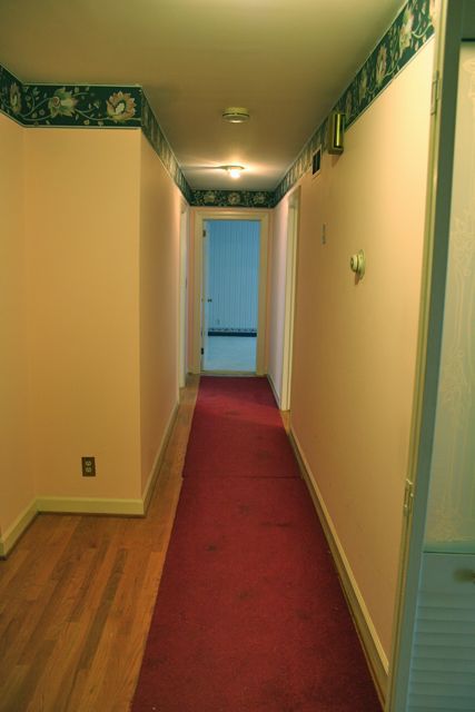
When we first moved into this house, we had done most of the painting (thanks to my mother, who operated one of those rollers very bravely, if you ask me). Originally, this hall was rose pink from top to bottom, with glossy pink trim, and a horrific navy blue paisley wallpaper border. Heaven help us all.
 Try not to cry, I know it’s hard. You can juuuust see the bifold doors–painted gloss pink–at the lower right there, and you can also see that the upper half of those doors is etched glass. Oh, yes, it is. Did you even know such a thing existed?!? I didn’t, and I wish I were still so innocent. And the runner rug–oy, vey. My heavens. Needless to say, after our rainy moving-in day, that was the very first thing to go.
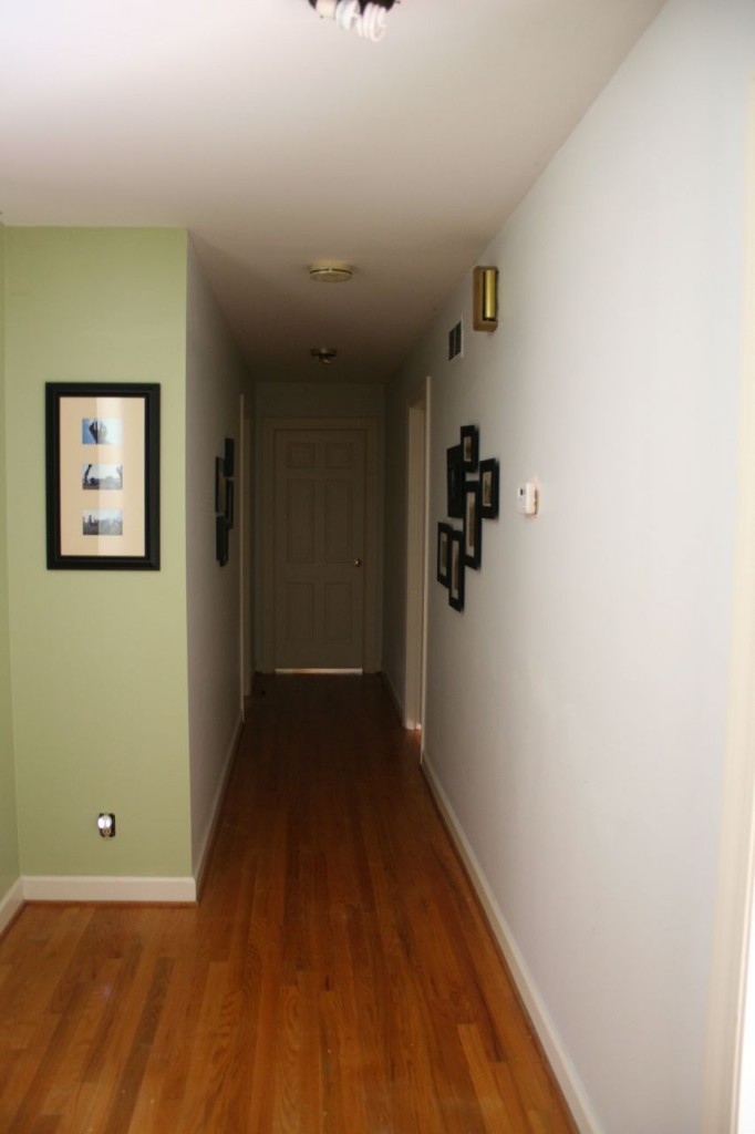
The pink doesn’t look so obvious here, but trust me, in person, it was intense. As the grey paint went over it, the pink-ness seemed to actually JUMP out at you, vengeful like, as if it were defending itself from being covered. We’re fairly certain the whole house was redecorated when Dynasty was still on the air, and this pink along with the navy & country blue, seems to support that theory. The border was a giant pain to cover, too, and since it steadfastly refused to even consider being removed, that wasn’t an option; it has since been painted over and will forever be a hidden part of the internal skeleton of this house. It’s still under there, now, lurking, having given up the fight and resigned itself to being an understory on this wall. Fortunately for me and for you, the grey paint is vastly more restful, and the entire hallway much more pleasant now than it was:
This shot was taken with the overhead lights off, no flash. Because the hall is at the center of the house, it gets very little natural light–the small bit of sunlight you catch in these images is coming from the front living room (off to the right in the pictures) and a teensy smidge from the den, by way of the sunroom (off to the left here). So a clean, light color was in order, no doubt. For the hallway itself we chose a soft grey, to brighten it up without going stark white. There are some corners and angles here, though, that made me not want to have every surface in the hall the same grey–since all the common areas are the painted pale green (the living room, den, kitchen, and dining room all share the same paint color), the walls that face toward the front of the house–which are visible from the entryway–are green, as well, to create some cohesiveness as you’re entering. I didn’t want the grey to be jarring and cut apart the entryway and den, plunking a big dollop of grey between those two green spaces. So the walls that you see from the entryway are all green, and then the grey picks up in the main hallway, where it’s invisible until you are in the hall itself.
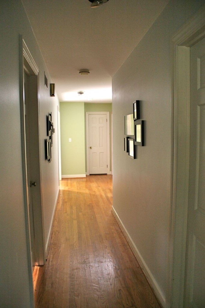
On the whole, now that the pink is gone and the wallpaper is covered and the floors don’t have 25-year-old carpet remnants on them any longer, it’s a very nice, albeit somewhat boring, hallway in a standard 60s ranch house (here, shot from the opposite end):
As much as I like the hall now so much more than I did previously, I’ve always wanted to give it a little POP, to make it really sing. Since you have to walk through it in order to transition from the public spaces in the house to the private spaces, it seems more inviting to give it a little extra personality and verve, so that we can feel pepped up on the sixty million trips each of us take down that hall each day, and so that the little glimpse our guests might get as they pass through to the den or head to the powder room will have just a tiny edge to them, something that makes our standard 60s ranch house stand apart.
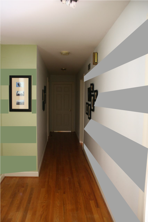
I’m thinking stripes. How you like them apples?
I already bought a darker grey and a darker green, so I can do nice, wide stripes down the hallway from entrance to the bedrooms. Seems like that’ll make it seem a little less overwhelming, give it a little more spunk, make it more interesting so it isn’t just this giant expanse of grey drywall. Part of me is pushing back a little, wondering if stripes are SO OVER and already DONE TO DEATH. But a larger part thinks this feels right for this house, has some interest and personality without trying too hard or taking over, and that it will provide a smooth transition between the more neutral tones of the common rooms and the brighter colors and more eclectic tastes of the three bedrooms on the other end of the house.
My temptation is to put this on the calendar and try to tackle it next time my husband goes out of town for the weekend. He really doesn’t like the mess of painting–in fact, when we were still dating he helped me paint an old apartment before moving, and that’s how I knew he really liked me. This is not a man who voluntarily will hold a paint roller.
Maybe I need to call my mom again.


Charlotte
November 14, 2012 at 3:56 pmI love the idea of stripes. Never mind if they are done to death (and are they? I have no idea!) – they will look fab!
Jackie
November 14, 2012 at 4:30 pmI like the stripes idea.
SEwing princess
November 14, 2012 at 4:59 pmI would keep the walls as they are. I like how you cleaned up the awful mess of the previous owner and I would keep it simple (background info: my walls are stark white 😉
Jan
November 14, 2012 at 7:51 pmLove the idea of stripes! I used to paint designs (including stripes) in clients’ home before my current fabric gig. I never tire of them! Two tricks, if you’re interested. Once you tape the stripe, paint lightly over the edge with the same color paint that’s on the wall already – to seal that edge and give you a super crisp line. The second trick is to use a semi-gloss (or even satin) in the exact same color as what you’ve already painted (assuming it’s flat or eggshell). This will create a very cool shadow stripe effect… not a total pop, however! Some of our clients couldn’t go all the way with the verve, so this was a nice in-between for them. Have fun!
Deborah
November 14, 2012 at 10:47 pmJust painted stripes in my dining room and I love it. Used the same color but used one matte finish and one gloss finish. Really shimmery in the evenings . . . . : ). Makes me want to put on a dress with pearls.
Sewsew
November 15, 2012 at 9:20 amI third the idea of subtle stripes using a different gloss (or a slightly diff color). That looks so fun and classy!!!
Miq
November 15, 2012 at 10:22 amIt doesn’t matter if they are done to death or not, if they make you happy, do it!
Ann
November 15, 2012 at 11:18 amI would totally recommend adding a light tube at the dark end of the hallway. We have an interior stair hall and because of how it goes put in two. It has made such a difference to bring in natural light.
Irelle
November 15, 2012 at 1:07 pmHave you thought of verticle stripes instead of horizontal. I used them in my entry and loved the look. They are about 20″ wide. I love the subtle idea noted above as well.
Laura Brown
November 15, 2012 at 2:28 pmI’ll make you a deal – I’ll come help you paint your walls, if you come help me paint mine! I’m local, so we could totally do it! The colors are terrific – I like the tone on tone stripes, and making them horizontal instead of vertical.