Progress in the kitchen slowed to an almost complete stop while we moved in and got settled, but now not having it finished is making us crazy enough that we’re ready to set aside organizing the linen closet and searching for lost boxes of fabric in order to get a little closer to the finish line. Still to do:
- install dishwasher
- hang pantry door
- prime and paint cabinet doors and drawers
- select and order new hinges–naturally, the old ugly ones were a non-standard size, so we have to get them off the web
- install new handles and hinges, hang cabinet doors
- select and install tile backsplash
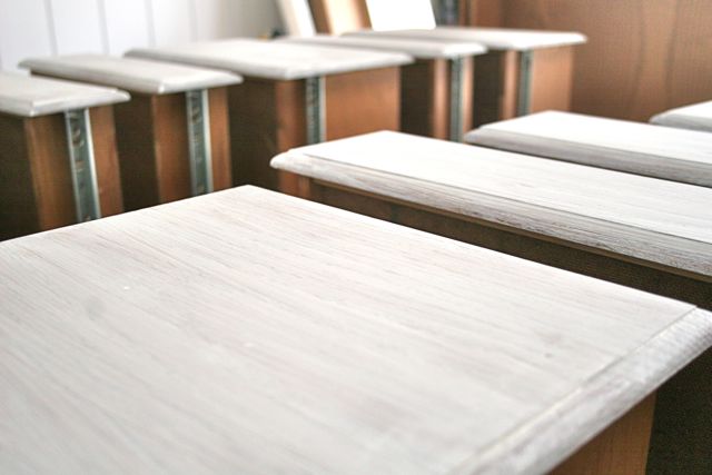
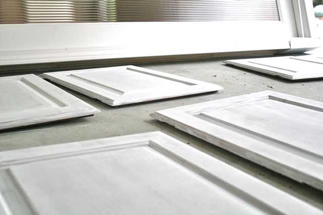
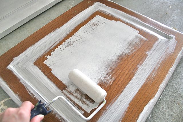
Today, our amazing contractor came over and put in the dishwasher and hung the pantry door, so that’s AWESOME. I spent part of yesterday sanding and priming the cabinet doors and drawers:
I took a lot of advice from these guys, and so far it’s going very well (knock wood). I’m pleased with this primer, too, since the other brand of oil base primer I used on the walls has left a very faint texture that I don’t love a whole lot–it’s only barely, barely noticeable, so you probably wouldn’t see it if you came over, but in just the right light at just the right time of day, I can glimpse it and I’m mildly saddened. But aside from the fact that we saved a cold five grand by painting the interior ourselves, not to mention using the existing cabinets, I am reminded over and over that even when the pros do something, it rarely is perfect, so I’ll sand a few spots that are irritating me and call it a day.
The cabinet doors, hopefully, won’t need any sanding–so far, so good:
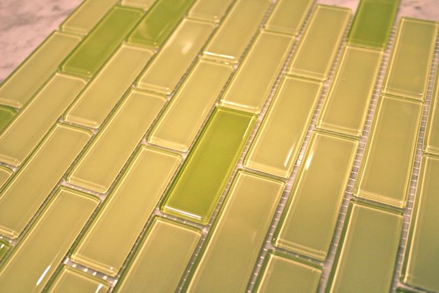
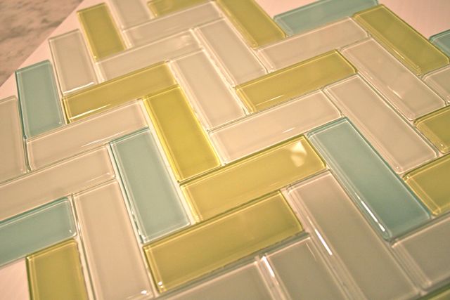
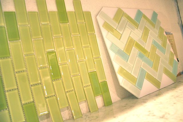
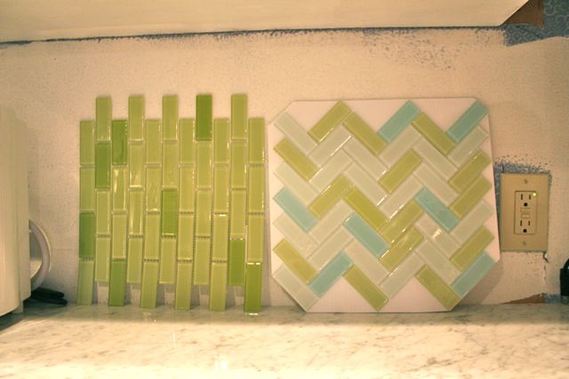
We also got in the samples in for the glass tile backsplash, and that’s where I need your help. We like them both, but I don’t know that we love either one–or maybe we love them both, but we’re not sure which we love more?
Both are 1″ x 3″ glass tile. One has two shades of green, the other has the lighter shade of green plus a pale turquoise and a veeery pale grey.
You can see the white marble countertops here with their grey veining, and the white of the cabinets above. You can also see the horrible country blue wallpaper that used to be there, and which will be covered up by the tile. This is the horror from which you could be saving us.
We have three options for you to vote on here, along with the relevant data to help you make an informed decision:
- I LOVE the green-and-green tile! You should totally install it vertically, because that’s how the cool kids are doing it.
- I LOVE the herringbone tile–but only if you install it like zigzags rather than chevrons. And NO, it is NOT too many colors of tile.
- I don’t know if I would choose either of these, even though the green in both is an EXACT MATCH to your wall color. I think you should go back and search for other options, like this suggestion I have for you right HERE.
These are your only choices, pollsters. Forget the primaries, no one really thinks they’re predictive–but THIS! THIS could be your date with backsplash tile infamy!!
Thanks for your help. We really do want your input, because we’re exhausted from making decisions and we need an extra few sets of eyeballs. Y’all rock.


Bon
January 12, 2012 at 1:23 pmthe green. though i am a purist and like the horizontal look of subway tile. 🙂
Deborah
January 12, 2012 at 1:26 pmMan, I hear you. I actually have fretted over horizontal-vs-vertical, which is how I knew we needed help. We both love the green, but are wondering if maybe we should make it all one color, rather than two? Michael is inclined to use only the darker green, to make a greater contrast between the grey of the counters, since the lighter color blends in a bit there.
Also: I might be taking this a little too seriously. Yikes.
Thanks for the vote! The green was the original choice, so it’s nice to hear that my initial instinct wasn’t too far off the mark.
Heather
January 12, 2012 at 1:33 pmI like the green as well, also horizontal. I think the vertical and the multi-chevron look cool, but I also think that 5 years from now you might get sick of the *trendy* look of it. If something is easily painted, refinished, etc. then I’d go cool. Anything that requires mortar and grout…keep it simple and classic.
Also, you could mix it a bit. If you have a small section of wall (over the stove, say) then you could do the green horizontal and then the chevron in the small space. It would add a pop, totally match, and give some visual interest that won’t be so overwhelming that you’ll get sick of it.
Deborah
January 12, 2012 at 1:36 pmThat was our biggest concern with the herringbone–too “hot right now” and not classic enough. It’s one of their set mixes, too. No wall above the stove–it’s at a half wall overlooking the den–and the places where I’ve seen the inset tile that stands out are a little more traditional than we’re hoping to end up with (although, to be fair, most of those were Italianate in style, so it’s hard to really compare). Sigh. Part of me is convinced we’re going to have to go tile shopping all over again.
Dree
January 12, 2012 at 1:35 pmI like the multicolored tile a lot more–I wouldn’t tie myself to just greens because I would be sick of it in 10 years. The other gives you options! Like blue walls in the future!
But I like the straight line pattern (vertical or horizontal) better than the zig zag.
In any case, I LOVE glass tile. I don’t have any, it came out of our budget pretty quickly.
I need to repaint my cabinets. Actually only 2 need is–the 2 by the dishwasher. I am not motivated.
Deborah
January 12, 2012 at 1:38 pmWe were worried if we didn’t get right back on the horse, we’d have all our dishes in cabinets with no doors for MONTHS. It wasn’t an idle fear, either–I can see it happening. Hope you find your motivation!
Mandy @ Sugar Bee Crafts
January 12, 2012 at 1:39 pmI am so glad I saw this – – my kitchen is that exact green, we’re prepping to paint our cabinets, and we are looking for tile backsplash options – it’s like I came across a parallel world when I saw this post…….anyways, love the zig zag, but wonder if it will still be loved in 20 years….. but I do love it – where did you find it?? my curtains have that green and turqouise in them….
Deborah
January 12, 2012 at 1:42 pmWe ordered both samples from SusanJablon.com –I guess she’s been featured on Extreme Makeover and HGtv a bunch? I was just looking for glass tile options, and her site allows you to custom-blend your colors, which we like a lot. It’s a splurge and not cheap, but as you say: it will be here for 20 years, and you can see it from four different rooms in the house, so we thought it might be worth it to choose something EXACTLY like we want rather than skimping and only liking it so-so. Hence our call for advice. 🙂
Alyson
January 12, 2012 at 1:41 pm#2 !!! I <3 the herringbone. The green tile that is an exact match to your wall color might be too matchy matchy. The herringbone has less of the green, making it much less overwhelming.
Deborah
January 12, 2012 at 1:43 pmIt’s funny, because at first I thought the herringbone had too many colors and now I like that it has less of the green! Plus, I like the way it picks up the grey veining in the marble and gives it some dimension… Hopefully we’ll make a decision before we both go crazy (crazier)!
Anita
January 12, 2012 at 1:45 pmI really like the green one but that is my favorite color.
Deborah
January 12, 2012 at 1:47 pmWell, exactly. And since the walls in the entryway, living room, dining room, den, kitchen, and sunroom are ALL that same shade of green, we’re wondering if maybe we ought to branch out for the backsplash? Hard to say.
Starjumper
January 12, 2012 at 1:50 pmthe zig zags are where it’s at.
Deborah
January 12, 2012 at 1:51 pmThey were a last-minute addition, when I was putting the green together. They jumped out and begged to come home.
SewSew
January 12, 2012 at 2:04 pmThey are both very fun. Love them. Of course, I’ve yet to meet a glass tile I didn’t love in some way. I like the straight subway look with the #2 colors, but only if you really want a super bright/fun look and if you will love these colors in 10 years. That’s a lot of color for a backsplash. It’s hard to tell from the photo – how does flashy glass tile look paired right next to marble? It’s not coming together in my head and can’t tell from the close up pic.
Like I said, I love them both. For me, I’d have to get something that offered a few more options for 2 yrs from now when I wanted a new color scheme. B/c goodness knows, my style preferences change with the wind!
Deborah
January 12, 2012 at 2:09 pmWe’re very tempted to throw a muted, clean penny tile in the mix, but again: too trendy? I don’t suspect this decision will get made today, I’ll say that. 🙂
Melissa, SoChick!
January 12, 2012 at 2:09 pmI love thy green! But I personally would do it horizontally. Whichever direction, I think green is the way to go. The zig zag may begin to feel too trendy an not have staying power over time.
Diane Christy
January 12, 2012 at 2:21 pmWow. Well, initially I wanted the green, D’OH. But now I’m leaning towards the zigzag colors, but in a straightline pattern. And I’m strictly a horizontal chick.
CrazyMomTats!
January 12, 2012 at 2:22 pmUse the green as shown, horizontally. I really do like the other colors, but the chevron pattern would make me crazy. Plus, I think it would be a bitch to install.
Rebecca S
January 12, 2012 at 2:22 pmI would most definitely pick the two-tone green. Reason? My unhealthy love of green. But mainly because you will have more decorating options available to you if you go with the classic layout of that tile. It can be a bright spot in the kitchen, but the zigzag shape of the other option would always compete with any other decor you wanted yo put on the walls. Hope this helps!
Kim
January 12, 2012 at 2:26 pmGreen, horizontal! I have a good friend with this on her backsplash and it looks AWESOME.
Herringbone is gorgeous but it may make things feel cluttered, and the kitchen is a cluttery place already.
Erin
January 12, 2012 at 2:52 pmI love the all green tile and for me vertical is the way to go. Reminds me of bamboo!
Karen Chatters
January 12, 2012 at 4:09 pmI’m not sure we’re very helpful here.
I like the green but horizontally. But perhaps that’s because you never see it vertically and I’m caught off guard. You rebel you.
But, I like the blue in the zig zag.
I’m thinking you may need to look more if you’re relying on us to solve your dilemma
MJ
January 12, 2012 at 4:26 pmGreen is my favorite color…so the green is my first choice.
However, I really do like the zigzag/chevrons, but I think with the white cabinets and light counter tops, it’s just too washed out imo.
Sequana
January 12, 2012 at 4:41 pm#1….I’m just not that fond of zig zags to be looking at it day and nite in a kitchen.
Plus I love the green color.
Phyllis
January 12, 2012 at 4:54 pmI have the green glass tiles, horizontal, they blend with my walls and I never tire of them. They are beautiful!!
Deborah
January 12, 2012 at 4:56 pmOooh, Phyllis, I don’t suppose we could convince you to send over a photo?? I would loooove to see something like that in place, just to get a better picture in my head!
Darcy
January 12, 2012 at 5:16 pmGreen, horizontal. The blue in the zigzags seems like it would never let you forget it or change the other colors around it (like what if you wanted to go with all citrus colors and get fun fiesta ware and that blue would say NO and annoy you, perhaps to death). What, over-think things, me? Maybe 😉 I say green, horizontal – love it. My second choice would be a nice, crisp white (which would ultimately go with any and everything).
lisa
January 12, 2012 at 5:30 pmI love green. I mean, I can’t stop pick it out. It’s EVERYWHERE in my house. In fact, wearing a green shirt right now. But, BUT I would pick a backsplash with less color. I would go with white subway tile. And I realize I am saying that without seeing anything else but the marble. Subway tile is Iclassic and clean. And that is what I would pick. You can change paint, but tile is going to be harder. Especially if you are not in “I would absolutely die if I couldn’t have this tile” love with it.
Something else to throw a wrench into it. If you do go with one of these what grout are you going to pick? Could make a difference is what it looks like.
Christine
January 12, 2012 at 5:37 pmI vote for #1 but I would install it horizontal rather than vertical. But vertical could be cool…
Heather
January 12, 2012 at 6:33 pmI personally like the zig zags but I like options for colors down the road. I’m also wanting to paint some cabinets in our kitchen and bathroom. It’s just such a daunting task. I would love to have a glass back splash in our kitchen though. We really need something.
Mika
January 12, 2012 at 7:35 pmI love the green/green – but would go for the more traditional horizontal personally – I think it would hold its currency longer i.e. not looking dated. Green can stay as a neutral – but blue colors tend to come & go more as ‘trends’.
good luck!
Dolores
January 12, 2012 at 7:54 pmOut of the two choices I like No.1 Green-Green BUT horizontally, I really don’t like the tiles laid vertically and it’s a look that will date. The chevron is cool but I agree with others that say it will always scream “look at me” and you will likely get sick of it after a while. My gut says you are not really completely in love with it and I’ve learnt that the things I really love when I buy them still make my heart skip a beat today. My other choice would be a white subway tile with a black band (to pick up the grey marble).
dxx
Nicole
January 12, 2012 at 8:32 pmNumber 2 looks nice with the countertop and gives some visual interest ala rail fence quilt block.
Leslie
January 12, 2012 at 9:14 pmOk, as someone with white cabinets, blue glass backsplash and green walls for the past 6 years, I have to say I agree with the previous poster about the white subway tile. The glass tile is beautiful an luminous and unique… But I sort of regret it and wish I had gone with a more classic white, maybe something a little rough or at least squared off at the edges, or maybe with dark gray grout. It is fun to play with paint color, but I think maybe tile should be more subtle. Go visit the cafe room at Star Provisions – I love their subway tile + green walls. Maybe you can put a strip or two of glass tile in a shower? It is really pretty. But sooo expensive, too.
Ginger
January 12, 2012 at 9:44 pmI vote #2. Since you have green walls nearby the added colors in the zig-zags will break things up a bit. They all blend together so it also gives you more colors to accent with. You might even want to sew some custom kitchen towels or something like that.
Miquela
January 12, 2012 at 11:12 pmGreen (#1) because the zig zag for some reason, is making me a little crazy. Too distracting? Love the look of the green tiles vertically.
Also, are your hinges truly hideous, or can they be spray painted? That is what I did with mine, and they came out beautifully, and saved so much $$, because really, who notices them?
Sparrow
January 13, 2012 at 8:00 amI LOVE the herringbone pattern, especially if you installed it in zigzags! I think that would be so fun! I like the variance in the colors more, as well. Though both choices are very nice.
jenn
January 13, 2012 at 10:04 amChoice #2. I think you’ll be glad you have the varied color in a few years!
Elin
January 13, 2012 at 11:48 am#2, not zigzaged, not herriboned. You will be glad to have the other colors in the backspalsh. I am sure of it. 🙂
Amy in VA
January 13, 2012 at 12:08 pmI’d vote #3 and go white/neutral. Take a look at Sarah Richardson’s portfolio. Paint, furniture and accessories can add the big pops of color and are cheaper to replace…
Sara
January 13, 2012 at 1:16 pmI love the boldness of a monochromatic look. Shades and tints of the same color. I don’t think it’s too matchy matchy. It’s cohesive.
suzette
January 13, 2012 at 4:58 pmI love the green/green, but only if it’s horizontal. Otherwise the other one is better… just saying. In the end you just have to figure out which one you want to look at the most 🙂
Rachelle
January 14, 2012 at 3:07 amI LOVE the herringbone tile–but only if you install it like zigzags rather than chevrons. And NO, it is NOT too many colors of tile
I feel the one with only green is a little overwhelming; the multi is a little lighter.
Steve
January 14, 2012 at 5:36 amYou can go to surfaceanddecor.com for a large selection of glass tile for backsplash, kitchen and bath. Surface Decor has free shipping on all products.
Meredith
January 15, 2012 at 6:42 pmI like the zigzags…because I’m obsessed with zigzags. They make me happy.
– Meredith
http://www.findingsoulbalance.blogspot.com
Diane Clark
January 16, 2012 at 10:14 amI would definitely go with option number one. the green is a great color and the two shades are enough to give you interest but not too much business going on. we did our kitchen over a few years ago and went with a backsplash that was textured but not too busy with colors and patterns. I want to still love it in 20 years since we won’t be doing it over any time soon. 🙂 But you can always add color and pattern with fabric and accessories that can be changed out when you get tired of them and they are not permanent like tile. Plus the subway pattern is classic…hope you go with that.
Kay
January 16, 2012 at 1:23 pmGo green, horizontal! The chevrons are pretty now, but will get outdated. If you think the green is too much because you have so much green, have you thought about horizontal glass tiles that are white with subtle touches of gray here and there to accent the counter? It would be a super nice neutral that would be classic.
Deborah
January 17, 2012 at 2:09 pmWell, let’s don’t rule out something like that, especially since I know your flawless taste can be trusted… Now we’re thinking we’ll go with a mosaic pattern–2x2s, 1x1s, and 1x3s all mixed up together–just in the greens. More variety i shape, but less in color so it looks textured and interesting without being too busy or overwhelming. Will have to invite you down to visit so you can admire it in person! 🙂
michelle
January 17, 2012 at 10:37 amgreen – classy and serene – the multi color along w/ the pattern just feels busy.
Steve
January 17, 2012 at 2:50 pmIf you need a variety of glass tile look at Surface Decor. They have glass, stone, metal for kitchen and bath.
Jen B
January 17, 2012 at 8:35 pmNormally I’d pick blue and green, it’s my favorite color combo, but the pale gray just isn’t working for me. I LOVE the green tiles!
Rob
January 24, 2012 at 11:40 amWow, i’ve been looking for a green tile with that type of pattern! Where did you find it?
Deborah
January 24, 2012 at 12:04 pmFrom SusanJablon.com –they do all colors of glass tile, and lots of custom stuff! It’s a shame we won’t end up using it, but we’re considering another one of her products pretty strongly. Hope it works for you!