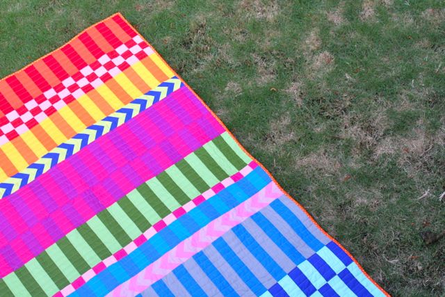
I spent a solid two weeks this spring hand-stitching a zillion little yo-yos using RJR’s Cotton Supreme Solids. They were each like little gems, perfectly round and fluffy and dazzling saturated in color. Problem was, when I went to put them together for the What Shade Are You blog hop RJR has organized, I was feeling pretty…meh.
Something about the shapes plus the wide range of colors felt like a box of crayons, in the best sense, but as they came together, I found myself looking for a new way to assemble them and have them feel sophisticated and chic.
Then I scrolled past this quilt on Pinterest–it’s by Dorie of Tumbling Blocks, her Peppered Cottons quilt that she entered (and won third place!) in the StudioE peppered cottons contest. I was absolutely mesmerized–it is such a lovely, striking quilt. I looked at the stack of fabrics remaining after cutting those yo-yos and I realized Dorie’s design was an elegant and sophisticated pattern to showcase the colors I’d chosen. After all, I had my pick of all the Cotton Supreme Solids colors, and had pretty much selected my Perfect Palette.
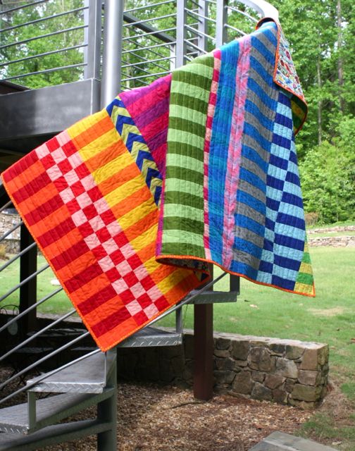
I’m a sucker for stripes of any kind, and obviously have a preference for saturated bright colors. I think of this as my Saturated Stripes quilt, and you know how I said my all-yellow quilt was my all-time favorite quilt I’ve ever made? Well, I think we might have a new favorite. Because I can’t even believe how well this quilt turned out!
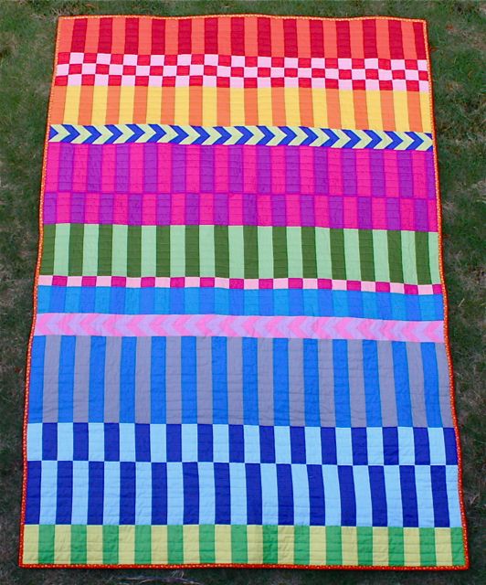
I spread my fabrics out and started pairing them up before I began to work. I wanted a balance of selections where the two colors were very close to one another versus some where the colors had a higher degree of contrast. I think the excitement and playfulness and movement of this quilt comes from the balance of lights and darks, cools and warms.
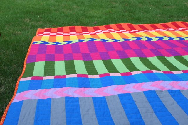
While I built the quilt top, I spent a chunk of time just moving different rows around and seeing the impact they had on the overall design–you’d be really shocked the difference it made to move the pink-and-lavender chevrons (don’t those chevrons totally make this quilt??) to lie between two cool rows, rather than keeping all the strips in ROYGBIV order. It called for the eye to focus and re-focus and shift around the body of the quilt in a way that’s really…well, exciting, if that’s not too quilt-nerdy.

I also thought a lot about the shapes in the quilt. I know it seems like it’s nothing but rectangles, but that’s the elegance in the design: it’s deceptively simple. For example, as I was cutting for each paired strip, I was guessing at how many pieces I’d need–which meant I cut chunks selvedge-to-selvedge and pieced as many strips as I was able to cut. As the quilt grew, it became clear it was going to be more square than rectangular, and it became even clearer that it wasn’t going to work as a square.
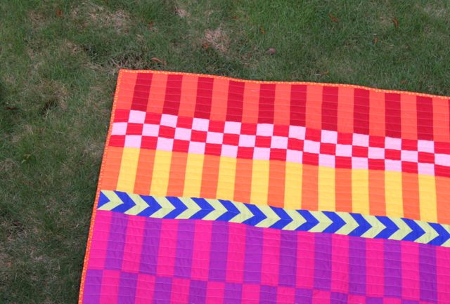
Part of the impact of the design really seems to stem from the fact that the rectangular shape is repeated both in the overall dimension of the quilt and in the individual pieces. So I started working backward and buffering my strips: some, like the orange-and-red at the upper edge, I expanded by making another strip and piecing it together with the colors lined up, so that the seam is largely invisible; others, like the fuchsia-and-plum strip, I duplicated but then off-set the colors when I pieced them together, to add a little more POP and movement. The pink-and-red even became a tiny, squared checkerboard.
The same thing happened with the quilting. I considered quilting on the diagonal (because I love it so much, for real), but thought that working in straight lines perpendicular to the shape of the rectangles would accentuate them. I started out spacing my quilting lines the same distance apart as the width of each strip, but that ended up making squares where the strips and the quilting lines intersected (duh–since that’s totally how geometry works). Suddenly, it was a quilt about a bunch of squares and the impact of the rectangles was almost completely lost, just like when the overall shape of the quilt became a square. Instead of picking out those lines of quilting (because who would willingly do that when there is any other option on the table?), I figured I’d take a shot and stitch an additional line down the middle, effectively cutting my spacing in half. And it worked!
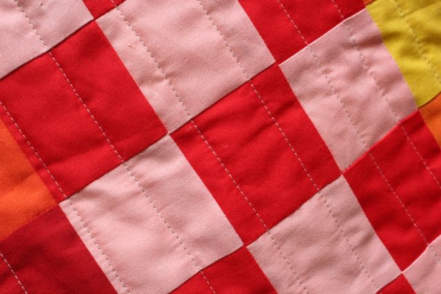
For the quilting stitches themselves, I struggled with what color thread to choose, and ended up going with a neutral grey (that tended toward a grey-ish taupe). I didn’t want it to pop out too much, but I also wasn’t willing to swap out thread colors with every section I quilted; grey is a much more versatile neutral than you might think, and I feel like unless you’re looking for the quilting threads, you don’t really notice the color, just the presence of the stitches.
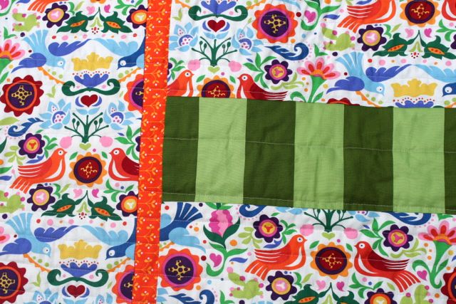
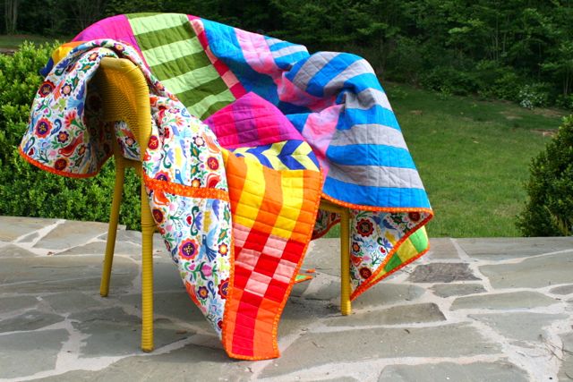
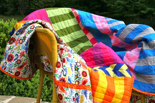
The back of the quilt is this amazing Alexander Henry print I’ve been hoarding for eons, along with an extra pieced strip of the greens that I ended up not needing on the quilt top (it actually got too rectangular!), and a skinny strip of the same orange floral I used for the binding.
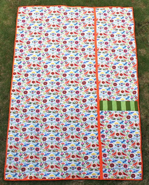
I think I had stashed away 2.5 yards of this Euro-feel bird print, and couldn’t quite pull the trigger on making anything with it, because I knew I really wanted to see it in volume when I used it. The colors are a dead match for the solids used in the quilt top, and I don’t think I’ve ever been more pleased with a quilt back.
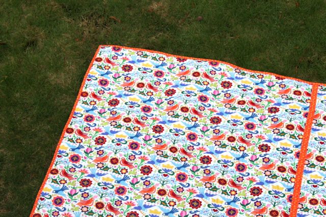
Honestly, sometimes I think selecting quilt backs and bindings is my special gift.
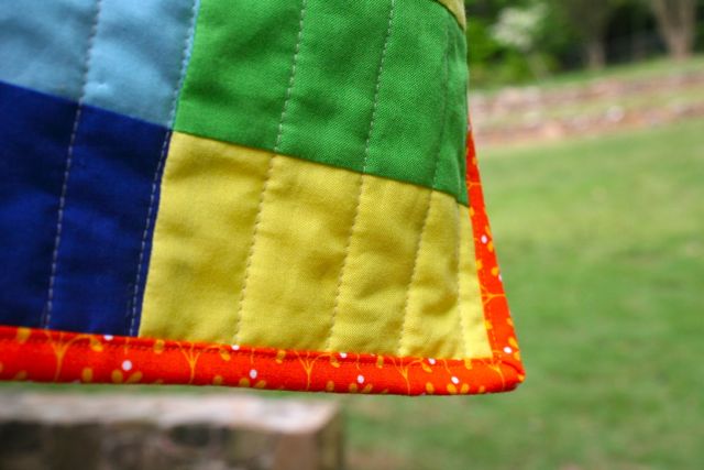
The binding is machine-sewn, which I realize some of you would consider super tacky, but it’s my preferred method, it’s very secure, and it’s fast to sew.
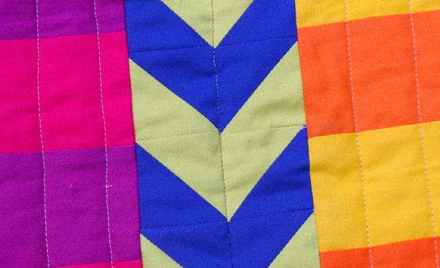
The chevrons might be my favorite part of this project. Or the little red-and-pink checkerboard, which makes me think of cake. Or maybe the way the strips jog when they’re off-set, which is way more pleasing to the eye than it sounds like it would be. Or maybe it’s just the gestalt of the thing, the overall impact that these colors make with this clean and crisp design. Gah! I just love it so much.
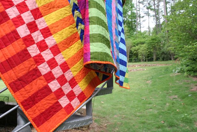
Should you want to look into some of these colors of Cotton Supreme Solids for yourself, I used: citron (color 337), sunny delight (color 326), tangerine dream (276), mandarin (159), flamingo (338), chili pepper (49), redwork (222), hot pink (217), rhododendron (181), bougainvillea (333), mauvelous (332), electric blue (296), royal blue (126), anemone (251), pool side (327), bora bora (328), wimbledon (205), peridot (342), martini olive (343), aloe verde (349). clover (128), and silver (125). These have a nice, crisp hand that’s a little lighter than Kona from Robert Kaufman but heavier than Cotton Couture from Michael Miller–they played extremely nicely and were lovely to press up. I didn’t use a single pin in the piecing of this quilt top, and the fabrics lined up and flew straight for me all the way through! Thanks to RJR Fabrics for providing the fabrics for this quilt!

I owe a special thanks to Dorie, who was gracious enough to permit me to use her design for the construction of this quilt. And if you’d like to make your own, you’re in luck! Dorie is working on a pattern RIGHT NOW for release. You can see her original quilt that inspired this one over on her blog, Tumbling Blocks, and subscribe to her RSS feed to be the first to know when the pattern is released. I’ll update you here, too, to make sure you get a chance to snag it and sew up one of these puppies for yourself! As Dorie said, this pattern would look so great in so many color combinations–I completely agree.
See more of the RJR Fabrics Cotton Supreme Solids Blog Hop on their Facebook page!

Ann Flower
May 2, 2014 at 10:40 amI like your quilt. The colors are so perfect for a summer quilt.
Deborah
May 2, 2014 at 10:42 amOh, thank you–I think so, too! I can already see us taking this to our family vacation at the shore in the little beach town where my mom grew up this summer. So bright and perfect for sitting on the sand!
So glad you like it! 🙂
Annette Deardurff
May 2, 2014 at 10:43 amI simply adore this quilt! You did a marvelous job – I like the back of it too!! I’ll be anxiously awaiting the release of the pattern!
Deborah
May 2, 2014 at 10:49 amThank you so much!! I am completely smitten with it. I had a brief moment just now where I thought how great it would have been to have thought to include a strip of black-and-white, but that’s sewing right? Always another project to make!
Looking forward to seeing what you make with Dorie’s pattern!
Barb Quilts
May 2, 2014 at 11:09 amI really like this quilt and enjoyed reading about it’s evolution. Solid colors are so fresh and lead to so many design options in quilting.
Deborah
May 2, 2014 at 11:13 amI completely agree–and I tend to not only quilt with solids but really dress in them, and decorate in them, too. Making this one was such a lesson in shape and proportion in a way I didn’t expect, and I doubt I would have learned that from working with prints on this project!
linda
May 2, 2014 at 11:58 amLove the colors and how the quilt is put togathet
Samina
May 2, 2014 at 11:07 amLove the bright colors & combo of colors! It’s just happy & sunshine-y & all things summery. Makes me smile, just looking at it.
Deborah
May 2, 2014 at 11:12 amYes, exactly!! I find myself this morning just wanting to be in the same room as this quilt. It’s cheerful, right?! So glad you like it!
Linda v
May 2, 2014 at 11:12 amBeautiful! Love the design!
Deborah
May 2, 2014 at 11:14 amThank you so much!! Dorie has really designed a beautiful quilt here–hope you get her pattern when it comes out!
Jenn Martin
May 2, 2014 at 11:14 amLove the pattern and the bright rainbow colors are SO me! Would love to make this one. I see and new quilt in my future.
Deborah
May 2, 2014 at 11:18 amRJR had SO many colors to choose from, so I really dug in and selected my favorites for this quilt–which led to a really bright quilt without much neutral! This was a really quick project to sew up (took me about four days, start to finish), so I think you’ll love Dorie’s pattern when it comes out! 🙂
Tiphaine
May 2, 2014 at 11:23 amI admire the work of quiliting but am really not into that. This one, on the contrary, waou!!! simple, colorful, joyful… I could see myself do one like that… on day…..;-)
Deborah
May 2, 2014 at 11:30 amOh, hooray!! To me, that’s the mark of a really successful quilt: that someone who doesn’t make quilts will look at it and say, “I could see myself making something like this.” What a huge compliment–thank you, Tiphaine!!
Cassie carney
May 2, 2014 at 11:28 amLove the bright colors. I make yoyo’s while watching tv and have yet to decide what to use them for
Deborah
May 2, 2014 at 11:32 amI’ve been working on a large-scale yo-yo quilt for (cough**cough) a while now, and I love working toward that big goal, but didn’t plan to make something so grand with these fabrics–and I don’t think it would have had the impact that this quilt did in these colors, either. My yo-yo quilt is all scraps plus pops of white, and somehow that softness is more pleasing than the saturated brightness of these fabrics.
I’m teaching a camp this summer where we’re making a shadowbox wall hanging with yo-yos, though! Maybe you’d like to use yours for something like that?
https://whip-stitch.com/camp-aloha-friends/
Bec
May 2, 2014 at 11:38 amBeautiful Quilt! It’s amazing how just using solids can make such beautiful quilts.
Deborah
May 2, 2014 at 11:40 amI agree!! Like I said in another comment, the fact that these are all solids really made me focus on shape and proportion in a way I didn’t expect, and I feel like the quilt taught me a few things in the process. So glad you like it!
Chris
May 2, 2014 at 12:55 pmYour quilt is beautiful I love the bright colors.
Debi L
May 2, 2014 at 1:07 pmReally like the stripes and how your eye dances around the quilt.
Louise Peeler
May 2, 2014 at 1:11 pmBright and cheery…what a way to lift the spirits!
Tami
May 2, 2014 at 1:19 pmThis quilt is amazing….and my preferred way of binding is also machine sewn. So much faster and more secure, I save the hand-stitching for that rare heirloom quilt I make. Thank you for sharing an inspiring quilt!!
Rachell R
May 2, 2014 at 1:30 pmLively colors!
This sure would be a great bundle to have with all the colors you used in the quilt. The fabrics sound fun and easy to work with.
I sure could use your help putting together a backing for the top I just finished.
reillyr2(at)hotmail(dot)com
Amanda Collins
May 2, 2014 at 3:39 pmI love the bright colors that you picked out and the quilt pattern!!!! 🙂 I would love to make one some day soon!!
Nicole J
May 2, 2014 at 3:59 pmAbsolutely love all the color combinations! Simply beautiful. Thank you for sharing. Will look forward to seeing and using the pattern.
Diana Collins
May 2, 2014 at 5:36 pmWhat a wonderful quilt. Thank you for telling us about your journey making it.
Rhonda
May 2, 2014 at 6:15 pmI’ve just recently become enamored with RJR’s Cotton Supreme color selection. Your quilt is a beautiful display of some of their options. I especially like how your backing coordinates; what an heirloom!
Julie T
May 2, 2014 at 7:38 pmLove the bright colors!
Cherie
May 2, 2014 at 9:08 pmYour quilt is so bright and cheery. It makes smile.
Pam S
May 2, 2014 at 10:14 pmIt’s absolutely beautiful! I love the combination of stripes and checks and wonderful color!
Lisa
May 3, 2014 at 2:41 amI love the play of colors. You’ve inspired me! Thanks
Laura
May 3, 2014 at 8:39 amLove the backing fabric! It coordinates perfectly!
Charlotte
May 3, 2014 at 11:16 amLove the quilt top & the back! Colors are “uppers” & design is eye catching! Great project. Would love to do it!
Wendy
May 3, 2014 at 12:15 pmI love rainbow colors and your quilt just brought some sunshine into a long, cold, and dreary winter. It’s beautiful! Thanks for sharing it and your story of how it came to be!!! You have a fan!!
Connie Rodriguez
May 3, 2014 at 3:53 pmI like the saturated stripes, the colors are bright, would be nice for a child’s room
Lisa
May 12, 2014 at 11:19 pmYour use of solids is so inspiring. Amazing.
Fresh Pack Quilt Pattern Now Available from Tumbling Blocks | Whipstitch
May 30, 2014 at 8:16 am[…] my Saturated Stripes quilt? It was inspired by the Fresh Pack quilt made by Dorie of Tumbling Blocks–and now Dorie has […]