The short version is: we’re still super stalled on the kitchen. The butcher block bar has yet to be installed, and while I’ve pretty much chosen a backsplash, it’s crazy expensive and I can’t seem to pull the trigger. I am pretty proud to say that I’ve installed one whole drawer handle–the other ten are here, but drilling those holes was harrowing–which represents serious progress. Still no cabinet doors (stop laughing at me for thinking it was a good idea to paint and re-hang those by myself), but we’re getting by. And honestly, Spring Break is making me feel way more motivated to get these things done. Must be Spring Fever.
In order to avoid feeling like a complete failure, though, I thought I’d share the one room that’s closest to completion: the living room. I acknowledge that it will be quite some time (if ever) before this entire house is really “done,” but this one room is inching along faster than the others, and it will make me feel better to hear your oooohs and aaaahs. Might even make me buy more trim paint. Ba-dump-bump.
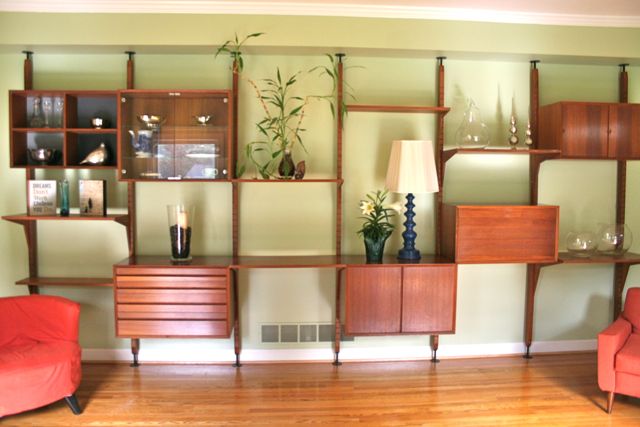
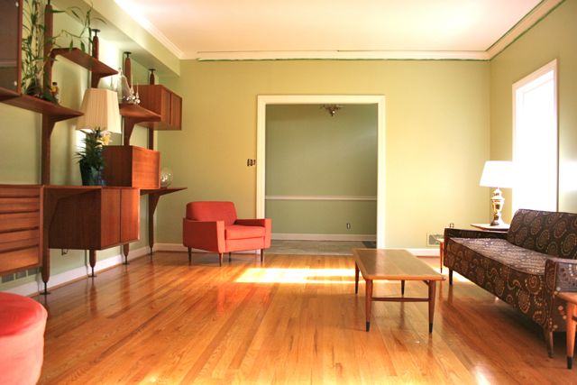 Our house is a pretty standard 1960s ranch, so when you enter the front door, at the far end of this photo, you’re in a foyer with a formal living room on the left and the wall to a bedroom on the right. Directly in front of the door, out of frame to the upper left of this photo, is the hallway to the bedrooms, with the den beyond that. In this photo, the dining room is behind the viewer; I was standing in the doorway between the living room and dining room when I shot this.
For comparison, this is what we started with:
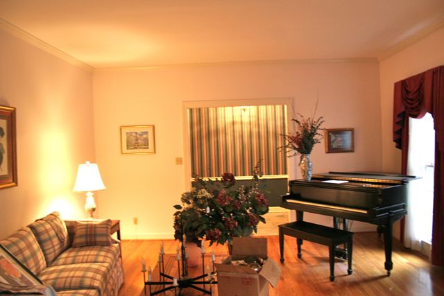 This was a snapshot taken at roughly the same time of day last October, when we did our walk-through. You’ll notice the wallpaper in the entryway, which we clearly painted; the depressing dullness of the living room itself–the ONLY room in the entire house that didn’t have either wallpaper or bi-fold doors (or both); and the lack of a soffitt on the left-hand wall (which we had built specifically for the teak wall unit that lives there now). Sincerely, even if this weren’t my house (and my sweat equity), I don’t know that I would recognize this as the same room.
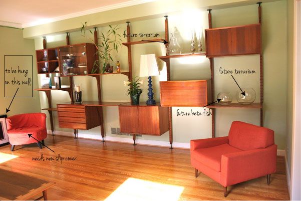
The wall unit is very obviously the star of this show. This wall is huge, and it needed something more serious than a sofa to set it off. I grew up with this teak unit in my parents’ house, and have always adored it–it says home to me, with the smell of the cabinets and the memories of all our “nice” things stored there that only came out for holidays and special guests. It’s a CADO unit, designed by Poul Cadovius in the 1970s; my folks got it when we lived in Europe with the Air Force when I was a baby. It’s eight feet tall, but the ceiling in this room is nine, so we built the soffit to fit the unit. With all sides of the soffit painted on all sides to match the walls, you hardly even notice that it’s there. I’ll be honest: I freaking love this thing.
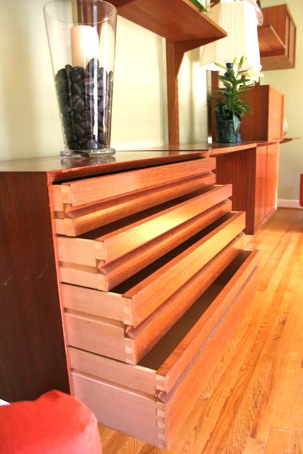 Each of the modules in the wall unit is designed for a different function, and when my parents bought it, you could pick and choose which ones you wanted. I’ve always loved this drawer module, and the glass-front upper piece. I love that there is a sliding-door section, in the far upper right of this photo, that’s sized to hold LPs. Oh, 70s.
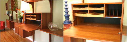
There’s also a desk with a drop-down leaf for writing and lots of little pigeon holes inside–perfect for kids to squirrel things away:
There are label-maker stickers still in there that read “outgoing mail” and “current bills.” I’m not sure which of my folks did those; either of them is fully capable of having gotten a little excited with the label-maker–but I’m betting it was my dad.
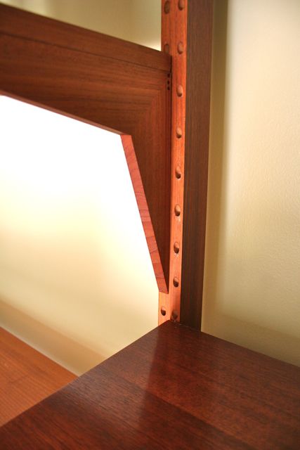 Each module and shelf attaches with these angled wooden prongs on the back–in the case of the shelves, they’re on the brackets, but for everything else, they’re on the back of the module itself. Line them up with the holes on either side of the poles, and you’re in business. Oh, and best part, if you’re feeling Brady-Bunchy? There are holes on the opposite side of each pole, too, so you can use the entire unit as a room divider, with modules on the back and front. Hello!
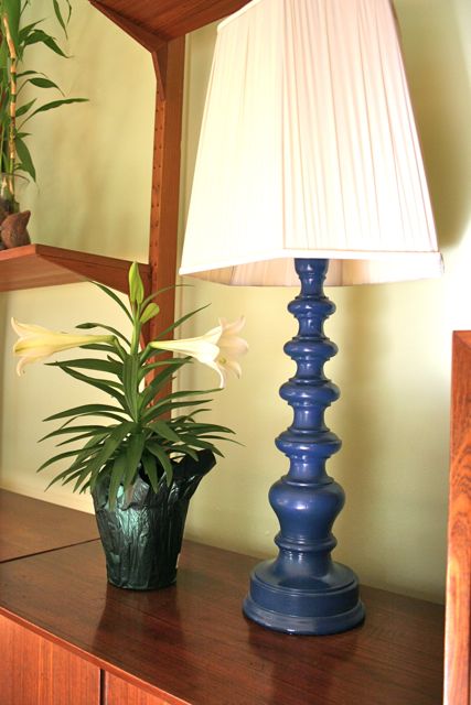 We’ve outfitted our lovely teak behemoth with suitable accessories–but not too many, since both of us tend to err on the side of fewer tchotchkes rather than more. This (FABULOUS) lamp was in the house before we bought it–we picked it up at the estate sale, and I adore it. At first, I thought I’d paint it, but now I’m using this cobalt blue color as an accent in this room, and the lamp is spectacular. Hi, there, Easter lily!
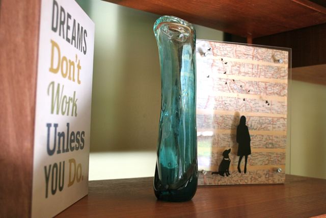 Art, from L to R: “Dreams Don’t Work Unless You Do” block print on wood, from Chicago artist (and super swell guy) Kevin Lucius; blown glass vase handmade by my grandmother; vintage map and acrylic overlay by Atlanta animal artist Yvonne Miller.
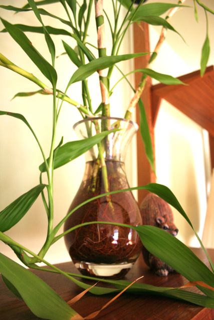 Bamboo that’s been growing and growing for somewhere close to ten years now. The squirrel, who is destined to be Pinterest-painted gloss white, says “SOON.”
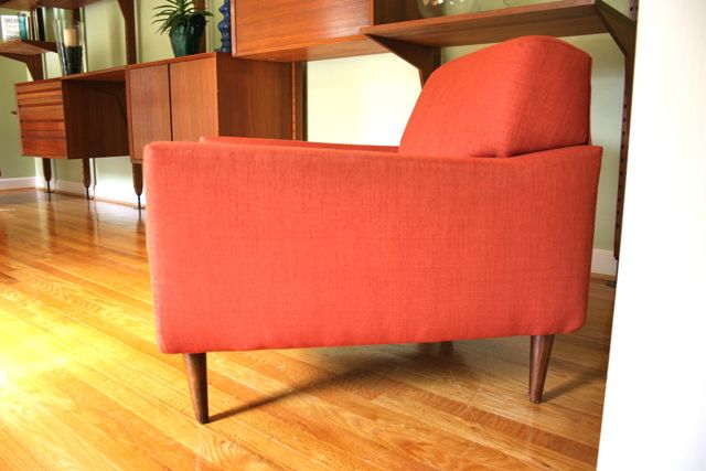 At one end of the CADO is a vintage chair I found on Craig’s List. It was recovered by the seller, and while the color isn’t my first choice, I think it’s going to work in this room. On the opposite side, though, is a similarly-colored chair whose slip cover is destined to go:
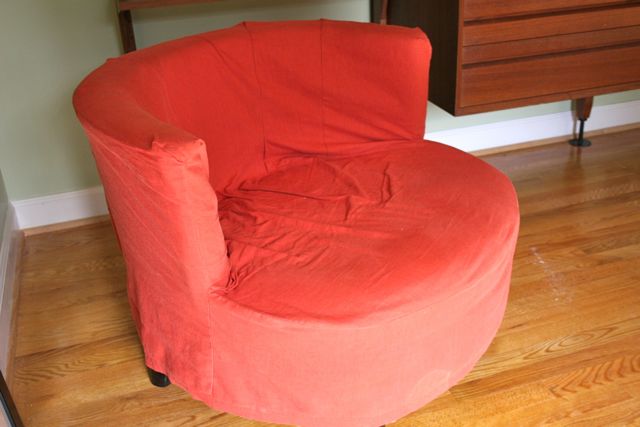 I think the rounded lines of this chair make it perfect for this room–which must by why my mother gave it to me when she brought the wall unit–but the slip cover has seen better days and the color is too close to the other chair, meaning it’s got to be re-done. Lucky for me, I’m teaching Home Dec as my next e-course, so I’ve got some fabric on the warmer, ready to rock this bad boy as a class sample!
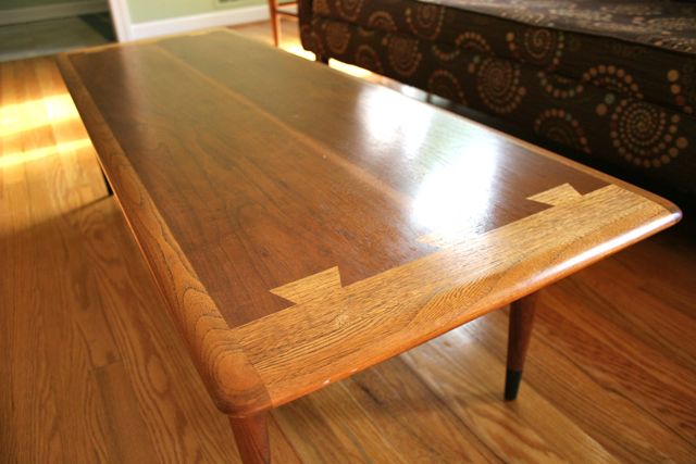
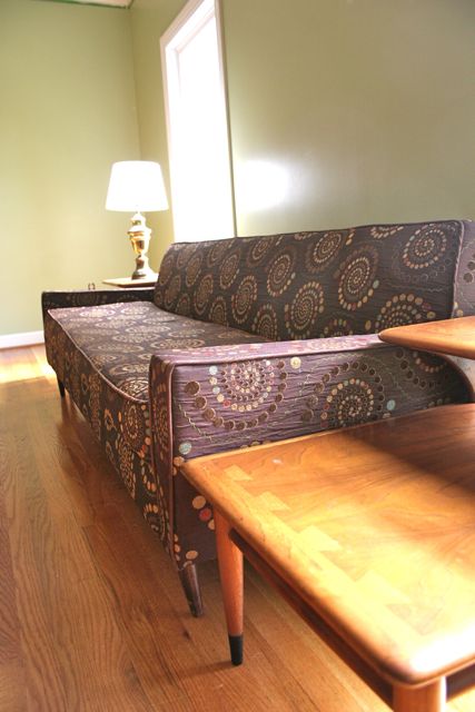 Opposite the CADO is the sofa, which came as a set with the orange chair (the one that’s NOT being slip covered). The seller had re-upholstered this one, too, but honestly I do not like the fabric. At all. It doesn’t make me cry every time I see it, but I cannot live with it. So I’m on the hunt for the perfect green-and-blue ikat print to recover and set the emotional tone for this room. The end tables belonged to my grandmother, and match the Lane dovetail coffee table I got when she moved to senior living:
 And there you have it! Obviously, there’s a lot left to do, but on the whole, this room is pretty close to liveable. Coming up:
- spray paint the two brass lamp bases chrome
- add window treatments–probably a textured white that runs floor to ceiling with a honeycomb header on rings
- slip cover the round chair
- remove the painter’s tape on the crown molding–oops!–and finish updating all the trim from cream (and lead–eeek!) to bright white
- ditto the baseboards
- find a rug, probably in blue (husband is resisting, but I really think we need a rug, don’t you?)
- hang our art on the walls, including the fabulous Puerto Rican king print my husband got when he visited San Juan
Plus a couple other fun projects, including getting a beta fish and making two terrariums…terrarii…:
 I DO feel better. Now I see why it’s taking so long. Maybe next week I’ll share the master bedroom–the master bath might never be un-ugly enough to show you, but the bedroom is making striking progress. Woot!


Jenny Pedigo
April 5, 2012 at 12:54 pmThis is fabulous…I had to read on, because I thought they were inspirational pictures…but their not!! Oh…I’m kinda envious right now, I admit it!! Just amazing…I love what you’ve done!!
Deborah
April 5, 2012 at 1:44 pmOh, how funny! No, I’d be much wiser to do an inspiration post, but seems like I tend to just Pinterest ideas and then wing it. Hee! There’s a long way to go, but thanks so much for the compliments–they’re hugely motivating!!
Janimal
April 5, 2012 at 1:32 pmFreaking awesome wall unit. And love the tables. And couch. Can’t wait to see what fabrics you use!!
Deborah
April 5, 2012 at 1:43 pmThanks!! I didn’t expect to get the end tables and coffee table, but they’re perfect for that room, and I love having something of my grandmother’s. I think I’ve chosen the fabric for the sofa, but am waiting for a swatch to order the yardage–whoo! BTW, we hired the contractor you recommended to come and give us a quote on the basement, and he stayed to do the demolition. He’s got great ideas–thanks so much for sending me his info!
Janimal
April 5, 2012 at 1:56 pmOh I’m so glad you like Mike! He did such an amazing job for us. He far exceeded our expectations. Every idea he had just turned out perfectly. We’re going to redo our livingroom with him next (new shelving, fireplace, moulding, etc.) and I trust him completely.
I was in your store Monday with my 3 year old. She said on the way home “That’s my favorite fabric store Mommy. I think you should only go there and not the other places.” 🙂
Deborah
April 5, 2012 at 2:02 pmHe’s just super smart and has suggested things that work really well with our goals but that we didn’t think were possible (like moving the entire HVAC/furnace/water heater assembly so we can eliminate an entire wall that’s blocking sunlight, or putting French doors into the guest room to get rid of an awkwardly placed door), so we’ve liked him a ton–which gives me guilt, since we also liked the guys who did our kitchen, but Mike is just very adventurous and willing to try cool stuff out.
Also: hugs to your 3yo for me! Clearly she’s GIFTED. 🙂
CrazyMomTats!
April 5, 2012 at 2:14 pmHave you checked out Jessica Jones’ fabrics? pretty nifty designs that would work well in this room.
http://howaboutorange.blogspot.com/p/my-fabrics.html
Good luck!
Deborah
April 5, 2012 at 5:26 pmI have a bunch of her stuff, actually, and love all of it! I think the colors in the two collections I like best are a bit strong for that room, but I might re-evaluate once I choose the ikat for the sofa. I have my heart set on that part, and once it’s nailed down, the rest will fall into place. I feel pretty good about what I’ve got on tap for the round chair, but I’m willing to wiggle! Thanks for the suggestion!
Jana
April 5, 2012 at 3:33 pmI love the history of your parent’s piece!!! I can just see it as a room divider in the 70’s so perfectly – and yet it also fits perfectly in a modern home in 2012. So inspired! (However… I don’t think any of the country floral from my childhood is going to work in my home). 😀
Deborah
April 5, 2012 at 5:23 pmThat’s what I love about it–I think my taste tends toward vintage modern, and my husband’s is a little more contemporary, so mid-century is where we meet in the middle. And having something that I grew up loving now part of my home where my kids can grow up loving it… That’s pretty awesome.
I think the country floral from your childhood can go live in that “before” picture, don’t you? 🙂
Heather
April 5, 2012 at 4:35 pmThat wall unit is truly a piece of architecture and is one of the loveliest, covetous things I’ve seen in a good long while. The fact that it has a desk puts it over the top.
I love the way it is all coming together. I don’t have this kind of design style. I can’t wait to see the rest of your progress. Well done!
Deborah
April 5, 2012 at 5:17 pmAren’t you sweet!! I can’t claim much credit, since it’s mostly hand-me-downs, but I am so pleased so far with how well these pieces that I love are suiting the house we’ve chosen. I’m with you: can’t wait to see what happens next! Hee!
Beta Dad
April 5, 2012 at 5:14 pmHoly cow! That wall unit is awesome! And the coffee table too. I love what you’ve done with the living room, and I think it’s especially cool that it’s not TV-centric. Very sleek.
Deborah
April 5, 2012 at 5:19 pmWell, there’s also a den, on the other side of the hall at the back of the house, and there is a TV there–but in an armoire, so in theory, we can close the doors. But we both like to have a front room that isn’t about TV and is more of a place to host and relax and read–I think of this as Michael’s “office,” but I don’t know if he agrees with me… We’ll have to have you out to visit when we’re closer to done/all the walls have drywall on them! 🙂
Ash P
April 5, 2012 at 5:33 pmIt looks amazing!! I wouldn’t mind my house looking like this 🙂
Deborah
April 5, 2012 at 5:39 pmOh, that’s so nice! Thank you for saying that! Makes me *much* more motivated to get the trim painted and the cabinet doors on–this room is the furthest along right now, but it’s not even my favorite! 🙂
Jessica E
April 5, 2012 at 6:58 pmWhat a cool wall unit!! I was shocked to read it’s from the 70’s! You’ve made such great progress in the room. Don’t feel bad about the kitchen, these things take a while especially when you want them to turn out perfect!! Plus, if it makes you feel better, we have been working on our TINY hall bathroom for oooo I don’t know 3 months now…and we’re not even redoing the shower so really we have no excuse, lol.
Also, I agree with you on the rug…definitely need one. 🙂
Irelle
April 5, 2012 at 8:04 pmThat is a fabulous wall unit. The room is great and once you have those last finishing touches complete, it will be perfect!.
melissa
April 5, 2012 at 9:39 pmLooks great! My mom has that coffee table and a matching square end table that she wants to sell. When I was growing up they had a set of Lane living room furniture.
Yzobela
April 5, 2012 at 11:47 pmYes, that wall unit is a.mazing. And the room looks so much bigger than the before picture, maybe because of the scale of your pieces. Lovely!
Diane Christy
April 6, 2012 at 9:07 amI think the CADO was meant to live there. It really is the star of the room and was a little neglected where we had it in our dining room.
I hope your dad reads your blog so he can see that our investment in this furniture has paid off!
Claudia
April 6, 2012 at 3:32 pmThere was an article in the WSJ on March 9, 2012, 3:10 p.m. ET
“Rules for Area Rugs, Decorator Alexa Hampton lays down the law. Carpet diem!”
You might find that helpful for your plan.
Having grown up with hard wood floors, I do prefer them but I’m also inclined to “dress” them. I love an eclectic look and would try an oriental or French type “Pierre Du” carpet (same colors as you’re using) I’ve always purchased carpets from stores that will let you try them for a few days to see if you like them. I’ve sent some back and the ones I kept I still love 20 years + later.
I’m intrigued with the 60’s as a current decor model having spent my early 20’s trying to change it to the cool 70’s.etc. Now I look at my home I see each decade represented and each child’s life reflected, it is something a decorator can’t reproduce.
I love that you have such a clear vision for your new home and enjoy seeing your energy for your projects as you combine your present life with your family history.
Can’t wait to the home dec class. 2012 has to represented!
Meredith
April 9, 2012 at 10:54 amI am 107% envious of the wall unit. Those things are GEMS… and you can NEVER find them. When you do, they typically range from 1 zillion dollars to priceless. Well done.
Deborah
April 12, 2012 at 11:32 amTrue confession: it took a while for us to convince my mother not to sell it–we even offered to buy it from her, because we both loved it so much and knew we could give it a good home. In the end, I think it was the house that sold it, because it sure does seem like it was made to be in that room! Thanks so much for your compliments!!
Sue D.
July 21, 2012 at 10:12 pmYour living room looks great. Your wall unit – did you know there is a unit like that, either identical or very similar, in the movie Pillow Talk with Doris Day and Rock Hudson. The unit is located in Tony Randall’s office (Randall is a friend of Hudsons, and uses Doris Day to decorate his office). When I watched the movie this last time and noticed his unit, it made me think of yours…and I just wanted to let you know.